Vote - which cover do you like best?
Kenny has drawn 3 lovely covers for you to choose from. Now, which do you like best? The cover must grab your attention to the bookshelf, make you want to pick the book up and buy it!
Kenny will have this up in his blog as well. Great job, Kenny!
Obviously, the covers don't have the extended title of the book yet, but Kenny did mention it was hard to fit it all in. So some people have been telling me not to include the extended title (sorry guys! it's not artistically cover friendly!) And I wanted to fit in the names of some of the contributors, but again, not artistically feasible, so they'll have to go into the back cover.


![]()

20 comments:
I went over to Kenny's to have a clearer look. His pictures are bigger :)
No. 1 : Why are the twins looking upwards? Reminds me those Old Master Q comics, he or his sidekick will look up into the sky, then everyone on the street will stop and stare too.
No. 3 : Aiyo, I'm having headache...
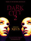
So that leaves no. 2 : my choice. It's very enigmatic and mysterious. Though the sharp nose hints of Mat Salleh, but it could be Chinese, Malay or others. (Think Pan Asian in advertising).
But... I don't really like the colour of the title and byline. How about doing them in red (as per no. 1)?
I like the 2nd one better...I don't think the other two would make me pick up the book...
Xeus,
We'll just let the comments/votes roll in, then when you're ready we can just tabulate the votes from your blog and mine.
For some background info behind each cover, you guys can read about it here.
Lydia,
You got the Pan-Asian part right, that's what I wanted --- something more universally appealing due to the anthology nature, meaning different contributors of different races.
Good comments, Lydia and WP. It's interesting to see how different all our tastes are.
No. 2 for me too!
But I think the face needs to look scarier. Or sadder. Or tortured. These faces make the book look like it's romance or some chick lit.
I like the idea of putting the contributor names in the back. Silverfish NW6 did it and I thought it was quite elegant.
I'll go vote over on Kenny's blog. :-)
Kenny, see what different tastes everyone has! Does that make both of us weird?
Nah, we're not weird, just unique in our tastes. (I guess everyone can guess which our fav cover is by now though we aren't voting ourselves.)
Voting results thus far:
A: 6 / B: 6 / C: 0
Kesian-nya Cover C... :P
WOW!!! I'd say that looks good indeed, my compliment to the artist.
My choice would be #2. Definitely.
If cover One has one face looking down or AT the other face (to indicate some interaction), then, yes, I would pick it.
Cover Three comes across as a bit pose-y.
So my choice is Cover Two, although I'd like the words 'Dark City 2' to be in a lighter or brighter colour.
Great improvement on the old 'Dark City' cover, Kenny & Xeus. Good job!
Hi Xeus,
My choice would be pic#2 because it looks more mysterious. However, I'd prefer red letterings and the face a bit more grim looking.
To me, the girl in #3 has a come-hither look which doesn't seem to suit the theme of the book. The gesture is fine but perhaps if the look is a little more "tortured" I guess it would be fine.
My two cents.
Pebbles
My vote goes for Number 2, most definitely. I'm a big fan of noir, and this captures the dark, melancholic mood perfectly.
The blurb could be shortened to something snappier. Perhaps: "One of the best to come out of Asia in 2006."
I'm glad I decided before I saw the comments. I'm with No. 2 too. Very striking indeed.
Well done Kenny!
Kenny, I think your stats is wrong. The covers in your blog is annotated differently. Your A is C here and C is A. Which means that the C here has 6 votes and A, nil.
it's number 1 for me. the part where both of them look up to the title is very.... symbolical?
Wah, looks like No. 2 is the vast favorite. But you all don't think it looks too Sidney Sheldon?
Kenny, Lydia might be right. Do check.
John, good suggestion about the blurb. I can use the ...
Xeus,
Yes and no. Other than Zewt, everyone else on your blog voted for Cover B (#2). Which means the vote is only flipped once, not 6 times as Lydia said.
Which brings the corrected tally so far to:
A: 11 / B: 22 / C: 1
Cover B is leading wayyyyy ahead. ;)
Xeus.. i like the 2nd cover. mysterious..
The 1st is not bad, it's twin image resonates with the '2', as if it implies a sequel. hehehe
3rd's design is ok, except the model's expression made it like an ad print for Panadol or other headache medicine. heheeh
good work, Kenny!
KokYee
I vote for the third cover. Dark and sexy... hee hee hee...
Post a Comment